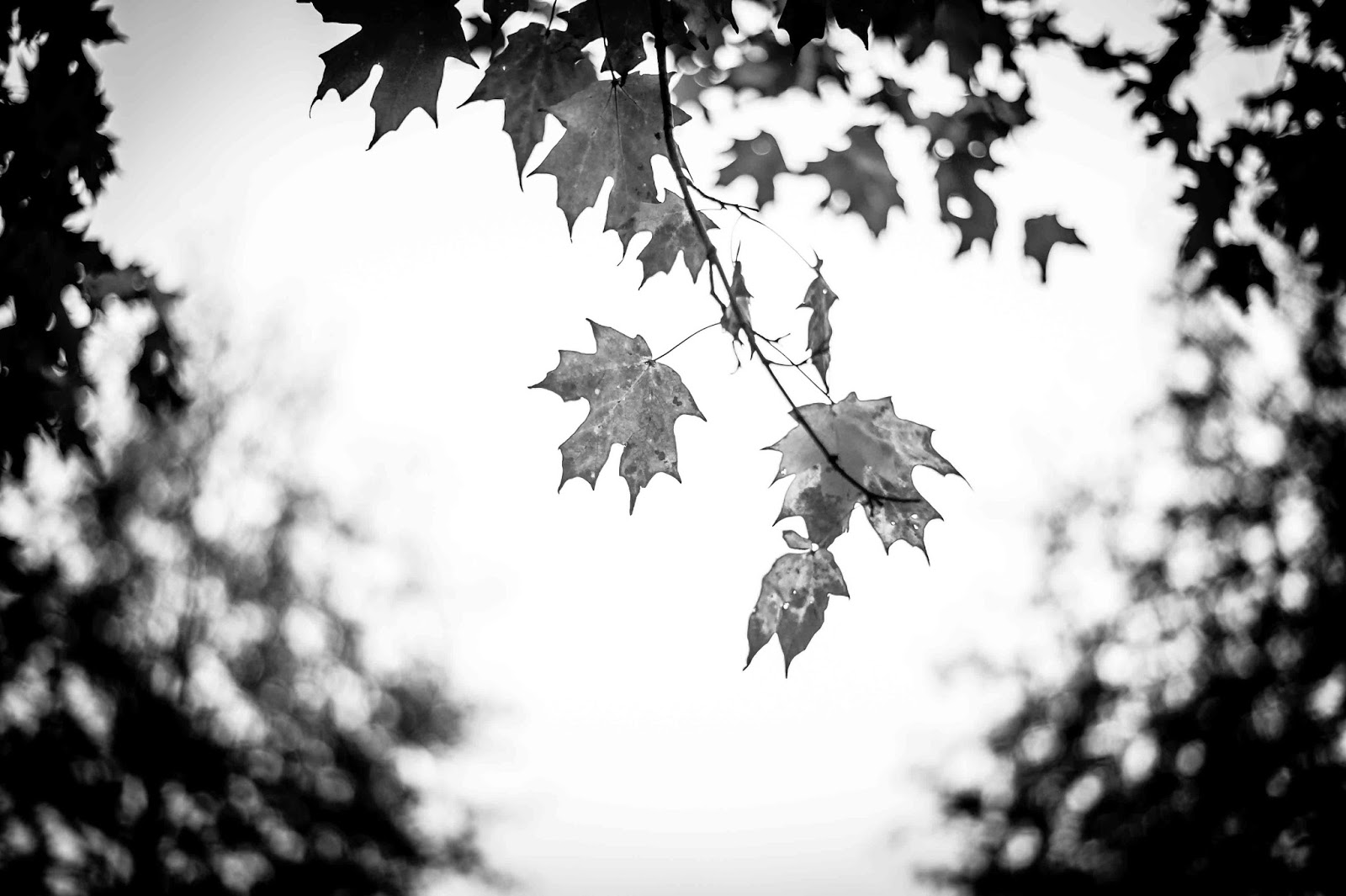
One thing I've noticed on the internet is lacking composition in fall photos. The person is trying to capture the beauty of fall leaves, they succeed in capturing the color, but it looks like chaos. The following two pictures I took today are examples. :)
No, it's not a terrible photo, but it sure isn't a GREAT photo. Why? Because there is no main subject. It doesn't have the rule of thirds, and nothing that draws your eye around the photo.
This is exactly the same problem in the next picture.
Here is a photo of the exact same tree, just closer...
Different, yep? It has a subject, the one leaf that holds your attention. Here's another photo as a good example. ;)
Why this photo holds is your attention is the leaves that are in focus draw your eyes in a triangle... Therefore it doesn't draw your eye off the page, and it keeps you interested.
This photos, has a ton of leaves, and would be terrible if that was the only thing in it. But the cat (his name is Rizzo... he wanted to be pet, and wound up jumping on my back when I was trying to take pictures;) completly changes it and becomes an adorable subject.
My final tip is, less is more. Keeping it simple is normally much better than trying to fit everything in the picture. :) Of course, there are exceptions... But with leaves, most of the time keep it simple.
I hope this was helpful! Any questions? Comment or shoot me an email. :)


